Hara Health Collaborative
BRAND IDENTITY & ART DIRECTION
Hara Health Collaborative offers clients Health Coaching, Massage, Classes, and Workshops through a collaborative approach to achieve their health goals by helping create a more balanced and calm life through wellness.


Project Brief
The owner of Hara Health, Katy, came to our studio needing help with a brand refresh. Her business and goals were scaling, and her brand identity no longer aligned with where she saw her company growing.
Research & Process
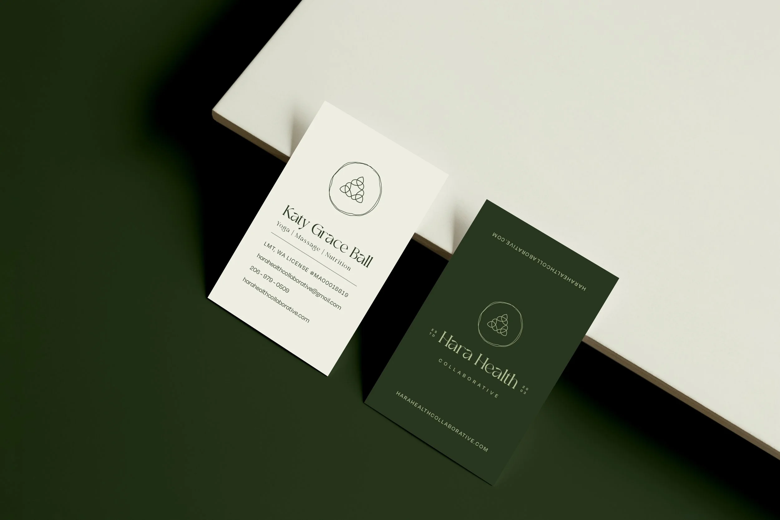
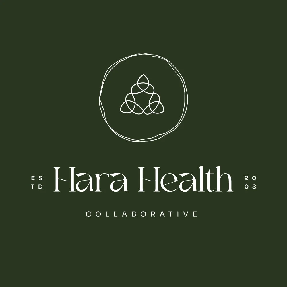
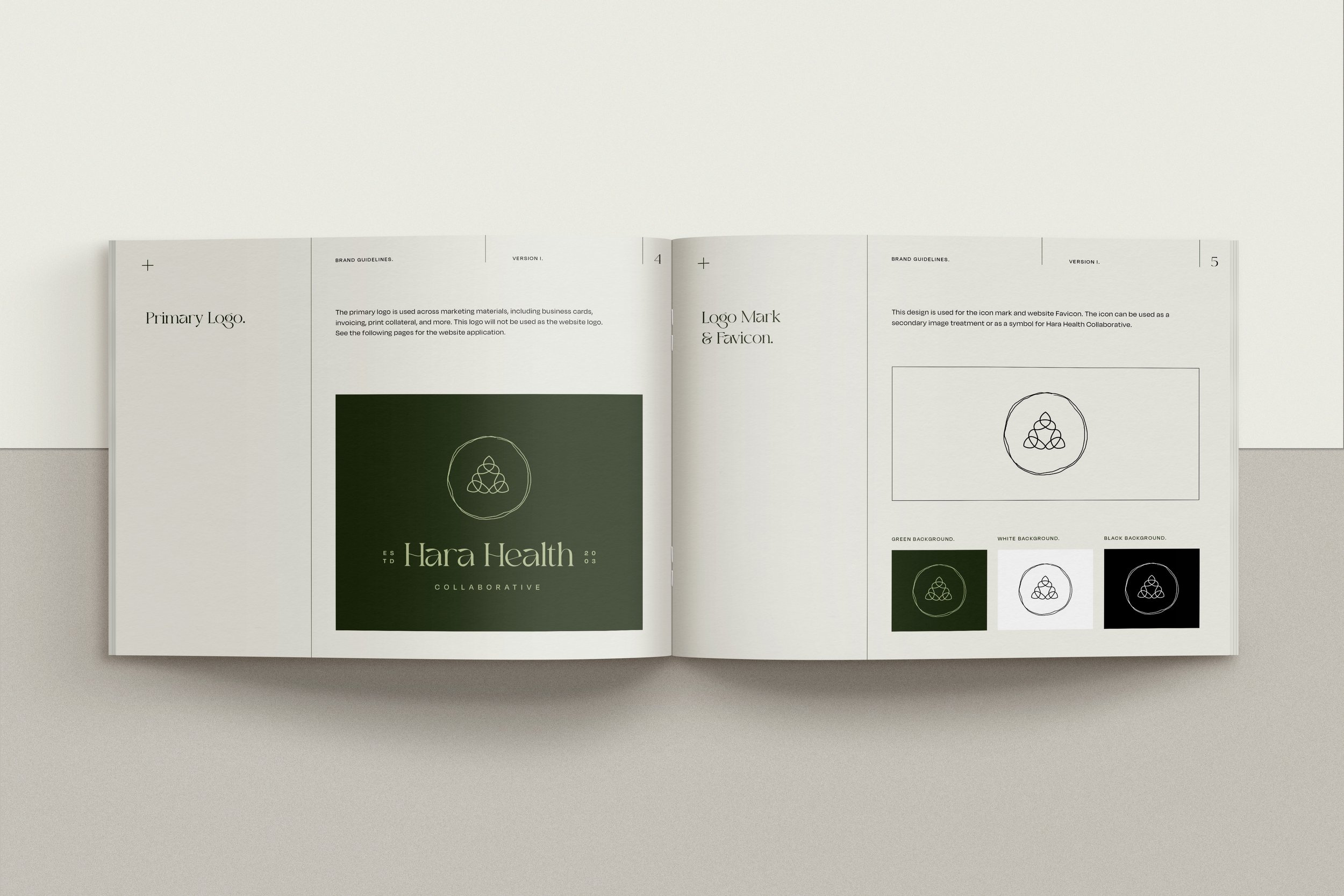
When meeting with Katy, she said she never resonated with the lotus flower and felt that only a few wellness providers used that symbol as their icon mark. She wanted something that felt unique to her and her heritage. Katy grew up in Ireland and wanted a symbol that would tie into her Irish roots without looking cheesy. She shared a unique Celtic knot with me, and we both fell in love with the concept.
Along with refreshing the logo mark, Katy felt that the color palette no longer aligned with her business vision. She wanted a color palette that felt like her client's experience working with her through coaching or massage.


LOGO DESIGN | ROUND 1
Initial Concept
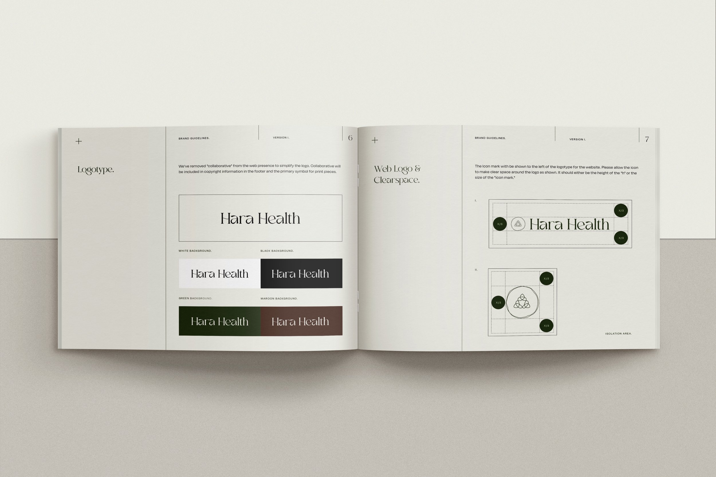
Inspired by our meeting, we wanted to create a logo mark unique for Katy using the Celtic knot symbol she shared. In creating the logo, we looked for a typeface complimenting the knot but not detracting from the icon mark. We immediately fell in love with the Moglan typeface because of its modern and slight Irish flare. After two revisions, we settled on three icon marks she could use for her branding.
BRAND BOOK SAMPLE
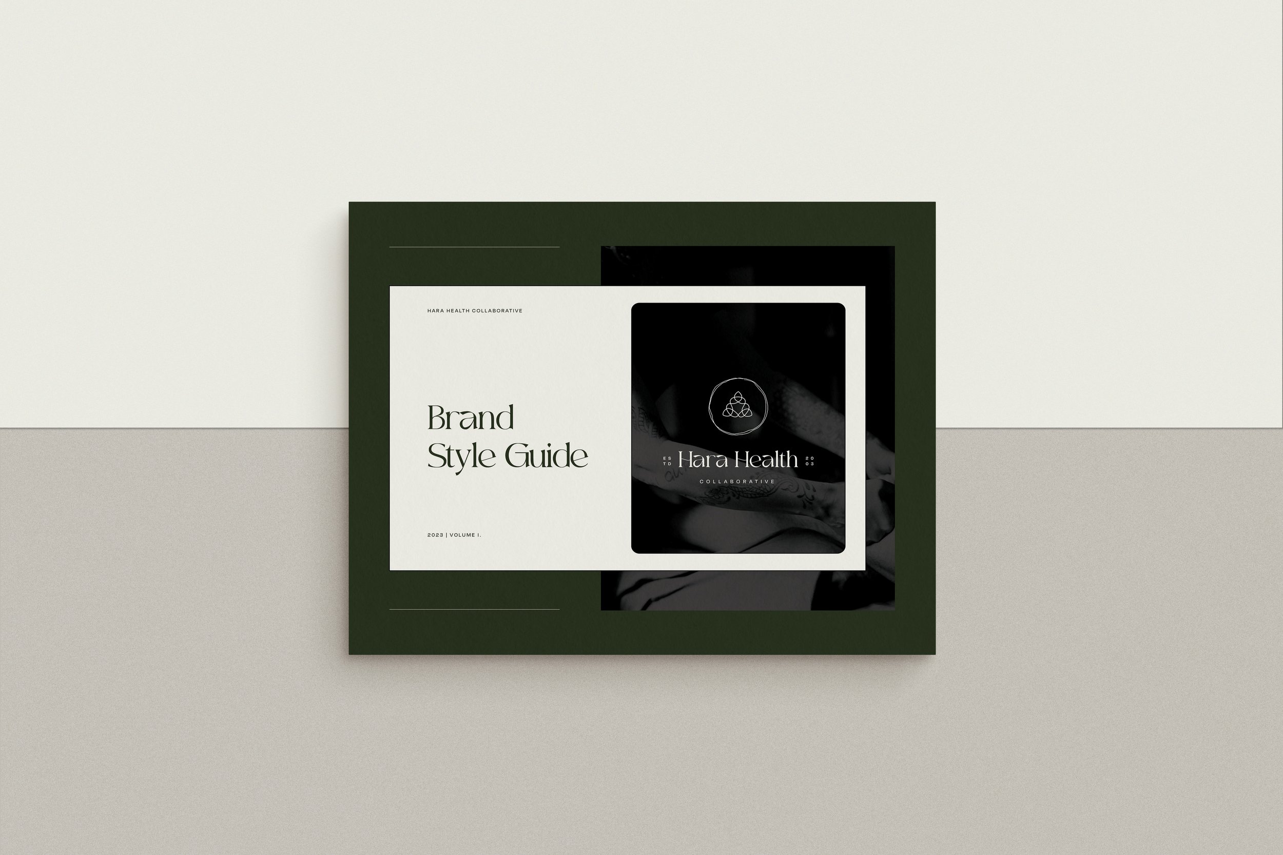
Brand Style Guide
At Reigel Design Studio, we offer two different brand packages: a social media package and an extensive brand style guide. Katy often attends wellness events or needs printed pieces, so she felt that the brand style guide would be helpful for consistency and her brand presence. Above is a preview of how the booklet turned out.
Including the brand book, we created a business card that felt unique as her logo mark. She wanted a vertical business card to stand out in her shared space at In Tune Healing Arts.
Business
Cards

Brand Launch
“Working with Carly was an amazing experience as a small business owner. She is organized and prompt with communication, a true shining star when reaching out and keeping the project on task. Her artistic vision reflects her natural talent and ability to listen deeply to bring alive the unique brands and businesses she works with. I am so grateful and excited about the design work she did for me in helping me rebrand my small business.”
Katy Ball, LMT | HARA HEALTH COLLABORATIVE